Screenshot setup
Setting up your environment for good documentation screenshots helps to ensure a consistent look and feel for your users.
Application setup
Display the application in its default state, unless you are demonstrating something other than a default setup. Use the latest supported release of the application for screenshots.
To display an application in its default state, do the following:
- Use the default theme, if one exists.
- For the Unity Editor, the dark theme is the default setting, so most users are familiar with it.
- Set the application to its default layout.
- In the Editor, select the Layout dropdown in the upper right corner and choose Default. If you have modified the default layout, then choose Revert Factory Settings instead.
- Make sure that all properties and text in a window are in their default state, unless you are specifically documenting a non-default state.
- Make sure that no properties or settings have a cursor selection on them. For example, when taking a screenshot of the Editor, confirm the following:
- Component properties are the default color, not the blue selection color.
- Dropdowns have no visual selection cues.
- Text boxes don't contain a text cursor.
If you are using a developer build of the Editor, disable the visual elements of Developer Mode (Preferences > General > Developer Mode). Disabling Developer Mode hides the colored debug dots, yellow help icons, and extra buttons in the Console.
Project setup
- Use a simple example project.
- Where possible, use Unity-owned high-quality assets, models, textures, and sample scenes. If you want to use third-party assets or models, get approval from your Legal Business Partner. For more information, refer to Image attribution.
- If available, use the Antialiasing effect to soften the appearance of edges in your scene.
UI setup
Resize the UI inspectors, views, and windows to include only what is necessary in the screenshot. Make sure to remove any extra or blank space.
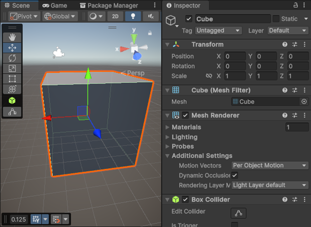
In the following examples, the UI elements are expanded and include too much empty space. This extra space makes the text smaller and more difficult to read.


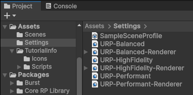
In the following updated examples, the UI elements have been resized to show only what is necessary.

