Empty states
Empty states are used when a list, table, chart, or other UI element has no items to display.
When a feature has not yet been used, an empty state can populate its otherwise empty window to help explain its functionality and invite the user to use it.
Empty states set expectations and build excitement while indicating that the space is empty for a reason.
Format
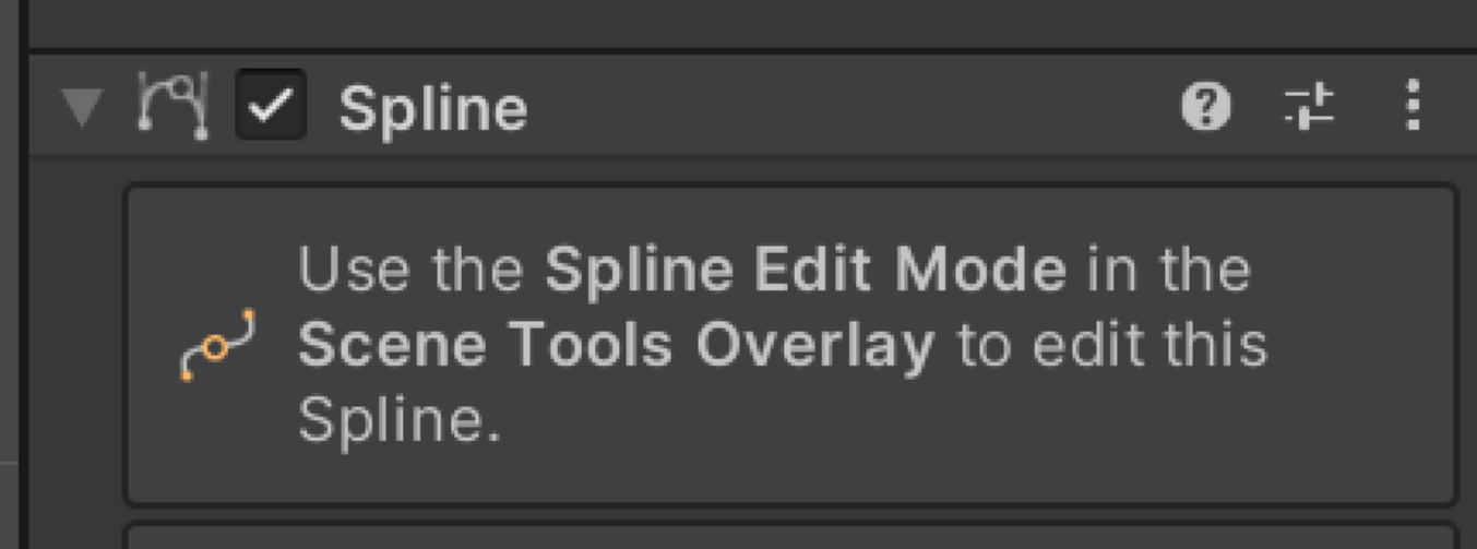
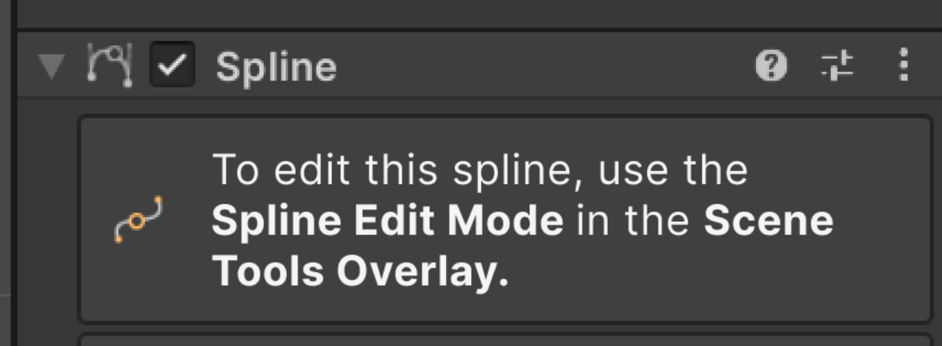
State the purpose of the action first, so that users quickly know whether to take the action or continue reading. For example: “To edit this spline, …”
Provide a one-line description and, optionally, a button.
Use one call-to-action button for the most important action that users must take.
Word choice
Whenever possible, lead with action verbs that state the goal:
- “To edit this spline, …”
- “To create a new timeline, …”
Explain or provide the first step needed to activate the product or feature. Try to provide only the first step.
In buttons, avoid unnecessary words and articles such as “the,” “an,” or “a.”
Be encouraging. Don’t make users feel guilty because they haven’t used the feature.
Example UI copy for empty states
| Incorrect | Correct |
|---|---|
 |  |