UI terms
The following table names and describes the most common Unity user interface (UI) controls. The examples include typical verbs for using these controls.
Generally, avoid making explicit references to the Unity UI to minimize maintenance and to accommodate multiple devices. The UI-neutral column contains examples for general use. However, when you’re writing about the user interface in particular, or writing for a reader who is likely to be unfamiliar with the UI, use details such as those in the for UI instruction column.
| UI element and description | Screenshot of UI | Example: for UI instruction | Example: UI-neutral |
| Add (+) button A button that allows the user to add an item to a list of assets. Bold the name of the button and the + symbol as shown in the examples. Related term: Remove (-). | 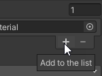 | To add a material to the Materials list, select the Add (+) button. | Add a material to the Materials list. |
| box An area for text or numerical input in a user interface. Use the term "box" only when it is necessary to refer to the UI element, such as documenting how to create a UI. To refer to a place where the user enters a value, use the property or setting label. Related terms: property, setting, field. | 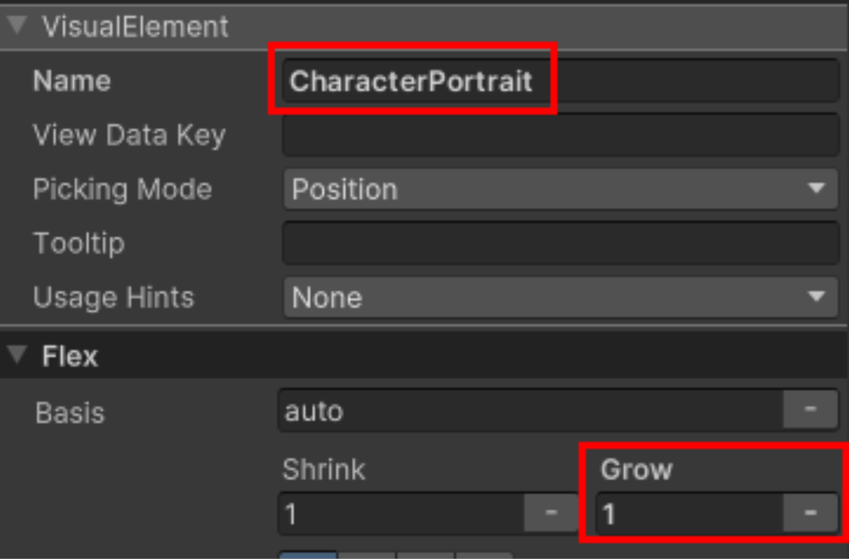 | The label of the box element is "Name." | |
| button A clickable control that initiates an action or changes a condition. Write only the button text in bold. Don't bold the word "button." Omit any variables in the button text. Related term: toggle. |  | To add a Light component, select the Add Component button at the bottom of the Inspector window. | Add a Light component. |
| checkbox A box with a binary state used to activate or deactivate a property or setting. Write only the checkbox name in bold. Don't bold the word "checkbox." |  | To display shadows on the GameObject, select the Receive Shadows checkbox. | To display shadows on the GameObject, activate Receive Shadows. |
context menu (right-click)A menu that appears after the user right-clicks. The menu items differ depending on the location (context) of the right-click.Don’t use “popup menu.” | 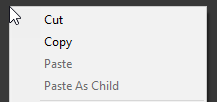 | In the Hierarchy window, open the context menu (right-click) and select Copy. | Copy the GameObject. |
| dialog A small modal window that requires the user to respond to a question before they can continue. If you refer to the dialog by the name in the title bar, write only the name in bold. Don't bold the word "dialog." Related term: window. | 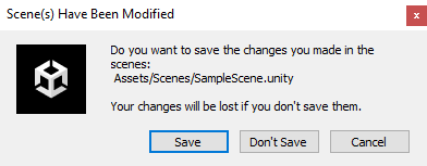 | If a dialog appears prompting you to save your project, select Save. | Save your project if you're prompted to do so. |
| dropdown A list of controls or options indicated by a label or an icon and a down-arrow. Similar to a menu, but might contain other UI controls. A set of options (also known as radio buttons) performs a similar function by allowing the user to select one option from a set. Don't write "dropdown list." Related term: options. | 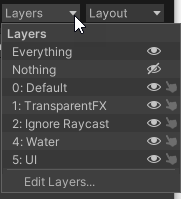 | Open the Layers dropdown and turn off the visibility of the UI layer. | Hide the UI layer. |
| field In API documentation, an area for input in a user interface, usually for text or numbers. Don't write "text field" except when specifying that a field is for text. Related terms: box, property, setting. | UnsignedLongField: Makes a field for entering unsigned long integers. | ||
| foldout (triangle) A control that allows the user to collapse or expand a list. |  | Use the foldout (triangle) to expand the Structure GameObject to view a list of its child GameObjects. | Expand the Structure GameObject and select Stair. |
| gizmo A graphic control in the Scene view associated with a tool (for example, move, scale). Use “handle” to refer to the interactive parts of the gizmo, such as the arrows in the Move gizmo or the cubes in the Scale gizmo. Write only the tool name in bold. Don't bold the word "gizmo." Related terms: handle, Scene gizmo. | 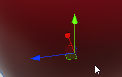 | When you select the Move tool, the Move gizmo appears with handles to move the GameObject in three dimensions. | Move the GameObject. |
| handle (=) A symbol indicating that an item can be dragged to another location. Bold the = symbol, but don't bold the word "handle." |  | Use the handle (=) to drag the material to the top of the Materials list. | Move a material to the top of the Materials list. |
| handle (gizmo) The interactive parts of a gizmo. Handles often indicate directions. Bold the name of the handle, but don't bold the word "handle." Related term: gizmo. |  | Select the y-axis handle of the Scene gizmo to view your GameObject from the top down. | Orient your view from the top, along the y-axis. |
| icon A standardized symbol that represents a type of asset or component. Use “icon” instead of “thumbnail” when the representation is standardized and not a preview of the asset. Don’t use “symbol.” Don’t use “icon” to refer to buttons or toggles in the UI. Instead, use the name of the button or toggle. Related term: thumbnail. |    | To hide the icons of all camera GameObjects in the Scene view, open the Gizmos dropdown, and disable the Camera toggle in the icon column. | Hide all camera icons using the Gizmos dropdown. |
| main menu The menu that appears horizontally across the top of the Unity Editor. |  | From the main menu, select GameObject > Light > Point Light to add a point light. | Add a point light (GameObject > Light > Point Light). |
| menu, menu item, submenu A list of options that appears when the user selects a main menu item or opens a dropdown, context, or More menu. Each term in the menu is a “menu item.” Nested menus are “submenus,” but never “sub-submenus.” | 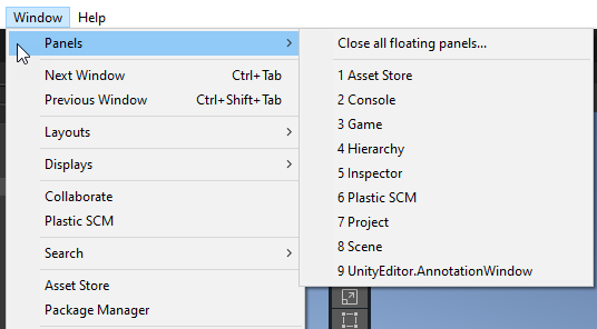 | After you install Unity Mars, the MARS menu and submenu appear in the Window menu. | After you install Unity Mars, the MARS menu and submenu appear in the Window menu. |
| More (⋮) menu The button at the top of a window toolbar that displays a menu (the More menu) of additional options. Use the HTML entity ⋮ for the vertical ellipsis. Bold the menu name and the vertical ellipsis as shown in the examples. |  | At the top of the Scene view window, open the More (⋮) menu and select Maximize to make your window fill the screen. | Maximize the Scene view window (More (⋮) menu). |
| options A set of choices displayed next to circular buttons or toggles, from which the user can typically select only one option. Also known as "radio buttons." Don't write "radio buttons." Related terms: dropdown menu, checkbox. | 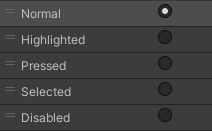 | Select an option from the Parameters list. | Select a parameter. |
| overlay A floating container of UI controls in the Scene view. Most toolbars in the Scene view are overlays (after 2022.X). |  | You can move the Tools overlay to any location in the Scene view window. | You can move the Tools overlay to any location in the Scene view window. |
| panel A section of a window. Don't bold the word "panel." If the panel has a name, write the name in bold when you refer to the panel. For example, the Preview panel. | 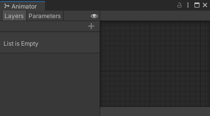 | The right panel of the Animator window displays your animation layers. Select the animation layer that you want to edit. | In the Animator window, select the animation layer that you want to edit. |
| picker (⊙) Target-like symbol that the user selects to open a window that permits them to choose a target object. Use the HTML entity ⊙ for the target symbol. Refer to the picker using the name of the property it's attached to. Bold the name and the target symbol, but don't bold the word "picker." For example, Material picker (⊙). |  | 1. To change the mesh, locate the Mesh property in the Mesh Filter component and select the Mesh picker (⊙). 2. In the Select Mesh window, choose the new mesh to use. | In the Mesh Filter component, select a different mesh. |
| property A changeable attribute in a component. Components control the properties of objects. Don't use "field," "box," "slot," or "blank" to represent the area where the user enters a value. Instead, refer to the property by its label. If you need to explicitly call out the UI element, such as documenting how to create a UI, then use "box." In API documentation, use "field." Don’t use “property” to refer to project-level settings such as build settings. Bold the name of the property, but don't bold the word "property." Related terms: setting, box, field. |   | Set the Intensity property to 100. | Set the Intensity property to 100. |
| radio buttons Don't use. Related term: options. | |||
| Remove (−) button A button that allows the user to remove an item from a list of assets. Use the HTML entity − for the minus sign.Bold the name of the button and the − symbol as shown in the examples. Related term: Add (+) button. |  | To remove a material from the Materials list, select the Remove (−) button. | Remove the first material from the Materials list. |
| Scene gizmo The directional indicator and control at the upper right corner of the Scene view. Related term: gizmo. |  | Select the y-axis handle of the Scene gizmo to view your GameObject from the top down. | Orient your view from the top, along the y-axis. |
| setting A changeable attribute in the Project Settings, Build Settings, or other settings windows. Don't use "field," "box," "slot," or "blank" to represent the area where the user enters a value. Instead, refer to the setting by its label. If you need to explicitly call out the UI element, such as documenting how to create a UI, then use "box." In API documentation, use "field." Don’t use “setting” to refer to a property in a component. Bold the name of the setting, but don't bold the word "setting." Related terms: property, box, field. | 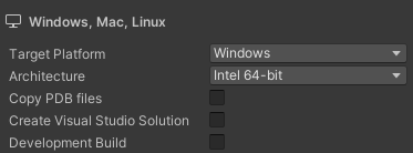 | To change your platform, go to File > Build Settings and update the Target Platform setting. | Double-check the Target Platform setting (File > Build Settings). |
| slider A horizontal bar with a sliding control that a user can drag to change a numerical value. Bold the name of the slider, but don't bold the word "slider." |  | In the Material inspector, adjust the surface reflectivity using the Metallic Map slider. | Adjust the surface reflectivity using the Metallic Map property. |
| stops, alpha stops, gradient stops A set of markers for selecting colors and defining their relative position in a gradient. The user can add, remove, or drag the stops to configure the color and opacity of the gradient. There are two types of color stops in the Gradient Editor:
| 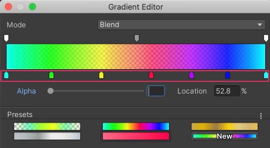 | In the Gradient Editor window, select and drag the stops to adjust the colors and opacity. | In the Gradient Editor window, adjust the gradient colors and their opacity. |
| swatch and dropper A set of specialized controls for selecting a color. The user can select the swatch to open the Color window or select the dropper to sample a color from the display. Related term: picker. |  | To change the color, locate the Color property and select the swatch or the dropper to select a new color. | Select a new color for the Color property. |
| tab A clickable option that changes the contents of the window or pane. Tabs can be horizontal or vertical. Don’t confuse a tab with a menu, which opens a vertical list of options. Some tabs might not have “tab” graphics. For example, the windows in the Unity Editor look like folder tabs, but the tabs in the Unity Hub have no graphics. | 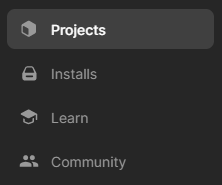   | In the left pane of the Unity Hub window, select the Installs tab. | Select Installs. |
| text box, text field Don't write "text box" or "text field" to refer generally to areas for user input. If you need to explicitly call out the UI element, such as when documenting how to create a UI, use "text" as a modifier when referring specifically to a box or field for text. Related terms: box, field, property, setting. | |||
| thumbnail A miniature preview of an asset that appears in the Project window or Inspector. Use “thumbnail” instead of “icon” when the file is represented by a preview of the asset. Related term: icon. | 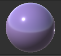 | When you adjust the Smoothness slider, the thumbnail of your material changes. | Adjust the Smoothness property. |
| toggle A button with on and off states. Bold the name of the toggle, but don't bold the word "toggle." |  | To change the view to 2D mode, use the 2D toggle in the toolbar at the top of the Scene view window. | Change the view to 2D mode. |
| tool A button that permits a user operation in the Scene view such as moving, scaling, or painting. Bold the name of the tool, but don't bold the word "tool." |   | To change your view of the scene, select the View tool (hand). | View your structure from the other side of the scene. |
| toolbar A row of controls, typically including tools, buttons, dropdowns, and toggles. Note: You can use the term "toolbar" even if not every control in the toolbar is a tool. Related terms: overlay, tool. |   | In the Game view toolbar, select the Play button to enter Game mode. | Start Game mode. |
| tooltip A temporarily visible text box that appears when the user hovers their cursor over a control or the text label of a property or setting. When writing about a control that doesn’t have a text descriptor, get the name from the tooltip. Note: Not all UI elements have tooltips. |  | If you need a reminder of the properties of a material, hover your cursor over the descriptor for a tooltip. | Refer to the tooltips for more information. |
| window Any framed content that prompts a user for information or provides a functionality to let the user work in the Unity Editor. Various windows have different behaviors. Except for dialogs, there's no style distinction between different types of windows. Related term: dialog. | 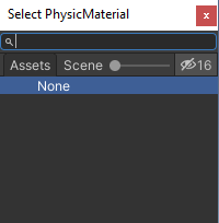 | In the Unity Hub window, select the Projects tab. | View your list of projects. |